Mobile App | Multiscreen experience
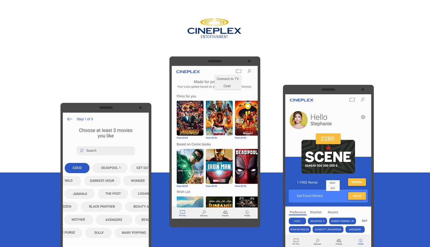
The Cineplex Store is an at home or on the go, digital movie watching destination. It offers thousands of digital new release and catalogue titles from major Hollywood, Canadian and International studios. Guests may rent or own their favorite digital movies and earn SCENE points with the purchase. Movies can be watched on most devices, including web and mobile, ROKU, Xbox One, LG and Samsung Smart TVs.
Cineplex is exploring multi-screen experience for Cineplex store to enhance movie experience to their customer who enjoys watching movies at their comfort of being at home. The project is designed to study how people decide what to consume and understand their user journey across different devices throughout their consumption cycle.
▸ Map Cineplex customer’s journey to understand pain points and study the need for second screen integration in their experience.
▸ Design and propose personalized movie watching experience and satisfy user's need by addressing their needs and pain points.

In the beginning, to understand the realms of home movie consumption, a research strategy was formulated to help understand,
Going further, Canadian Audience report by Nielsen Media Research and a case study on Discoverability compiled by Telefilm Canada guided the project in the secondary research phase to understand what most Canadians prefer to watch. Next, I proceeded to conduct a competitor analysis of some of the direct and indirect players in the market to review and study their solutions, features, interface standards, pricing and accessibility.

With the knowledge from the secondary research, the project was continued with user survey and empathy interview with few selected users of Cineplex store. Users who are also not a consumer of the Cineplex store were considered to measure and benchmark the satisfaction level, needs and expectation of using their most preferred movie streaming platform.
Interaction with users also helped us to understand needs and expectations from their standpoint. Notably, while auditing a user’s interaction with Cineplex’s TV App, the results show users pain points in their natural environment.
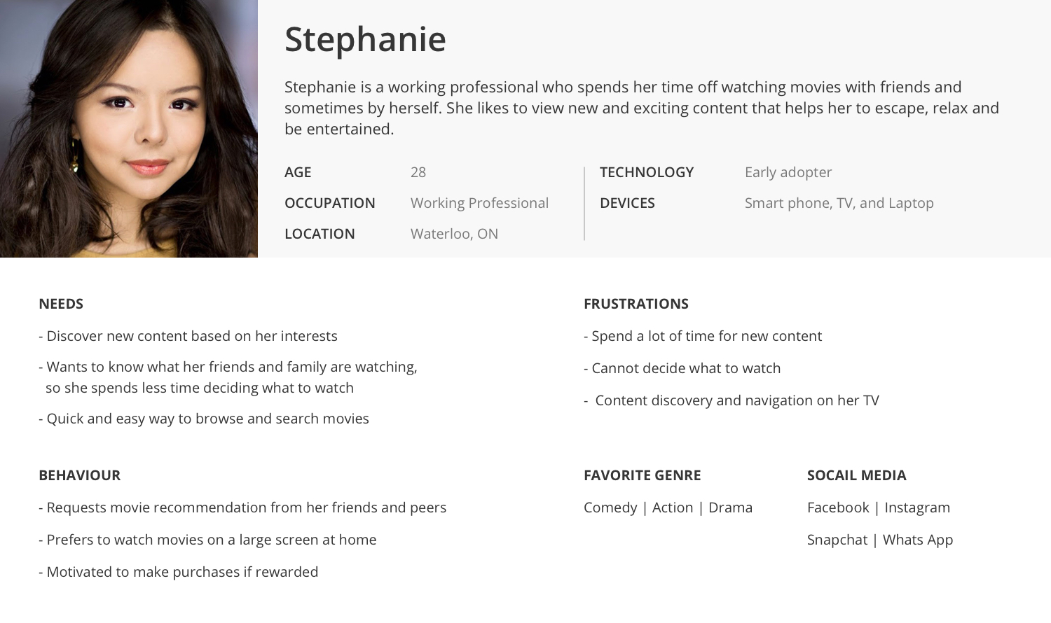
Preliminary research and user survey gave significant insights on problems that I could address in the project’s timespan. Additionally, based on project’s industry stakeholder feedback, a need to identify a potential users group was raised. Data from research pointed a new user segment “curious user group”. Telefilm report identified the aforementioned users as a new growing set of users in Canada. Later, the insights from interview, research data, affinity cluster, and product usability report resulted in a persona-Stephanie.
A user was chosen from the previous interview whose needs and expectation was close to our persona to understand user’s current satisfaction level with Cineplex store’s service. After an exploratory interview session, the user was asked to fill the value proposition canvas to map their perception of the current product.
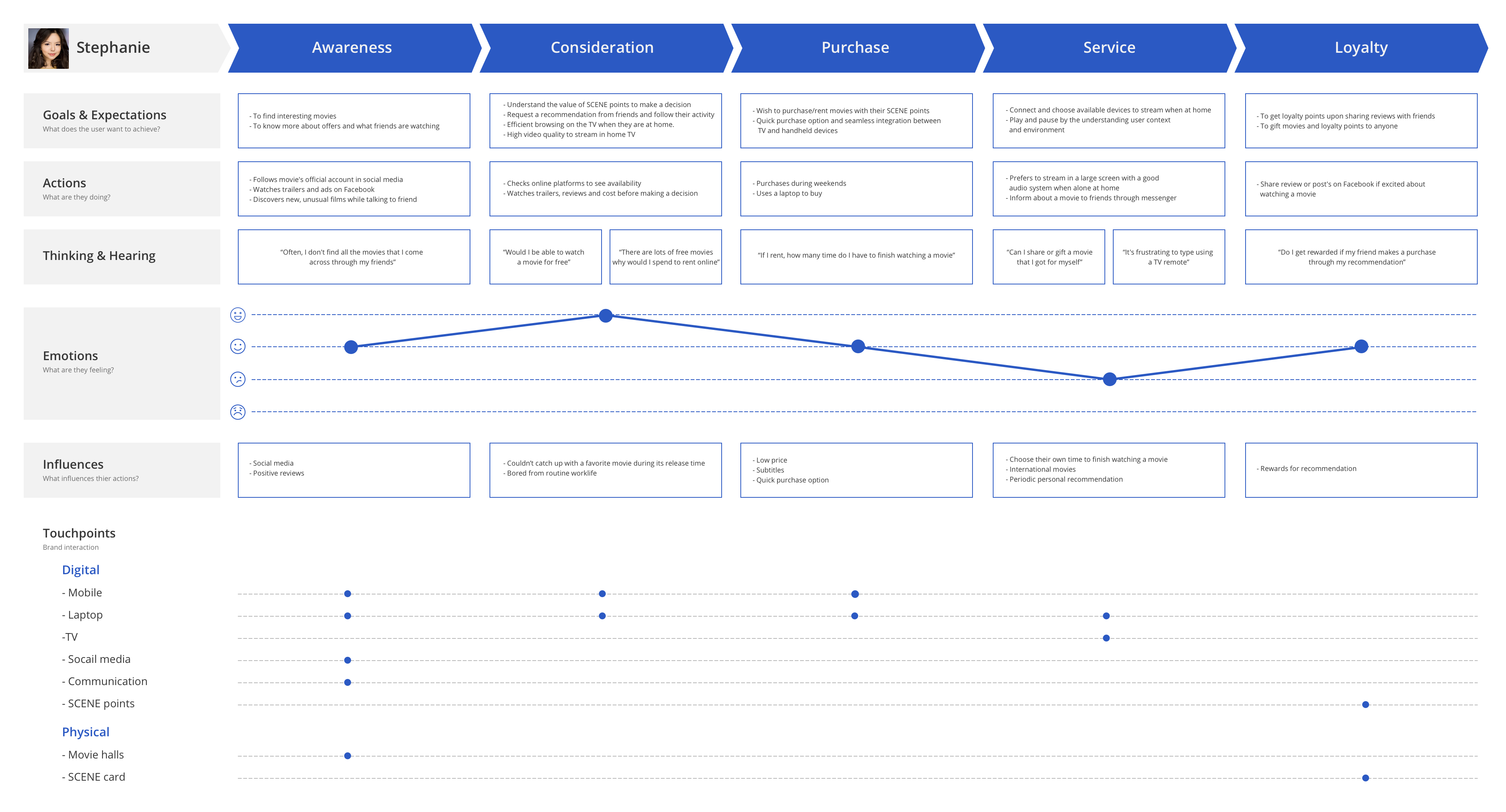
The business model gave me an idea to incorporate user journey within the purchase funnel touchpoint flow. Further, I utilized the interview results, and research data to illustrate the customer journey to create user stories that cover all the touch-points that the persona goes through while consuming the service provided by the Cineplex Store.
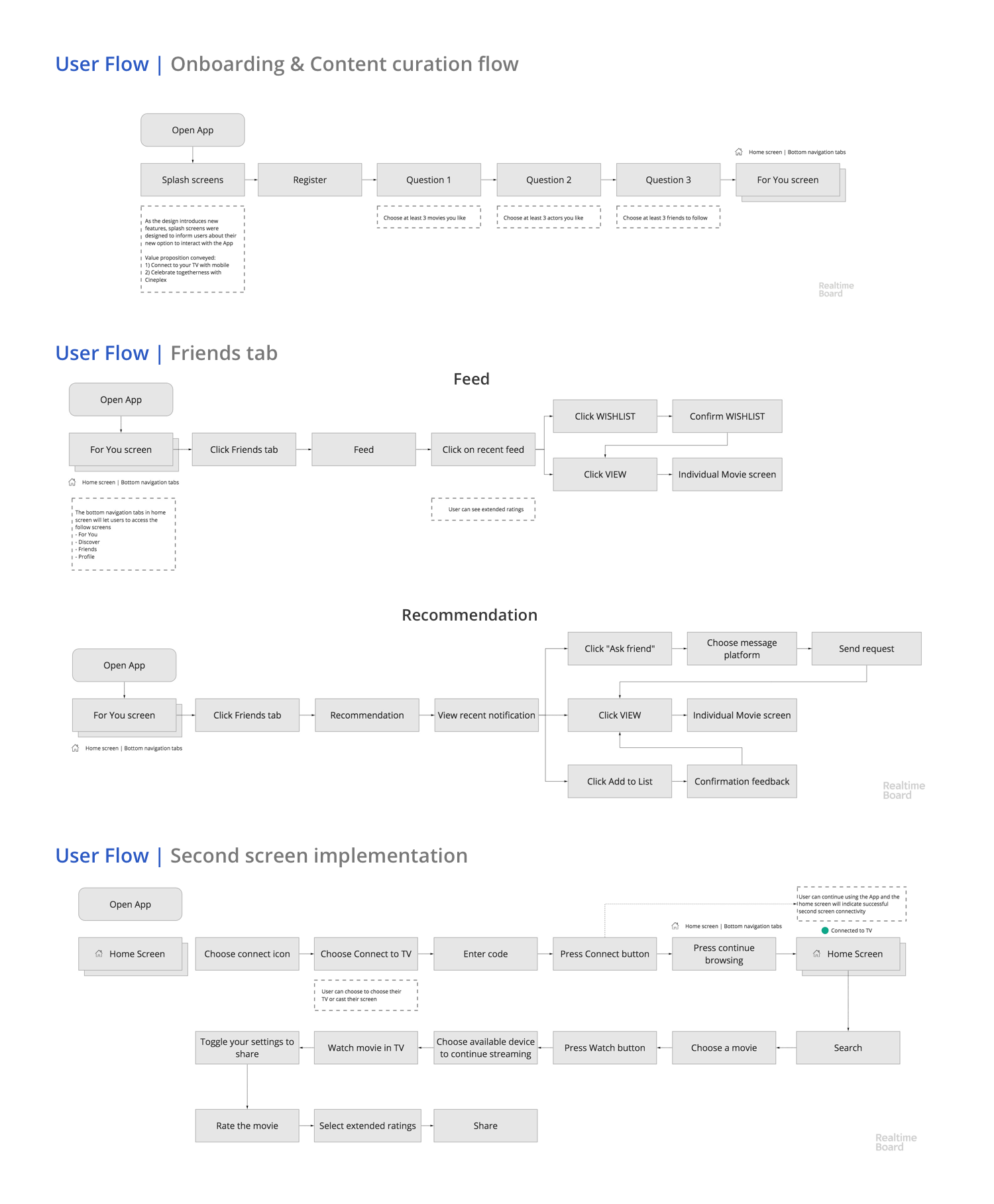
Next, I created a product feature priority document to limit the scope and streamline the set the features to design and incorporate at the later stage. Mental cards came in handy to prioritize features and cards also facilitated better consideration of human behaviour in the design process. Later, conceptual flow was developed to create user flows to address users needs within the app and to ease the process of designing low-fi sketches and wireframes.

From the conceptual diagram, three major user flows were identified that would improve user experience and introduce new features such as content curation, request recommendation from peers, and accessing TV through a smartphone.
After I developed the user flows, I continued to sketch solutions. To maintain consistency in design patterns and to simultaneously test with users, the sketches were further designed in Balsamiq. Later, preliminary user feedback sessions were conducted using Balsamiq cloud, and the feedback from users was implemented in the wireframing phase.
Insights from user testing
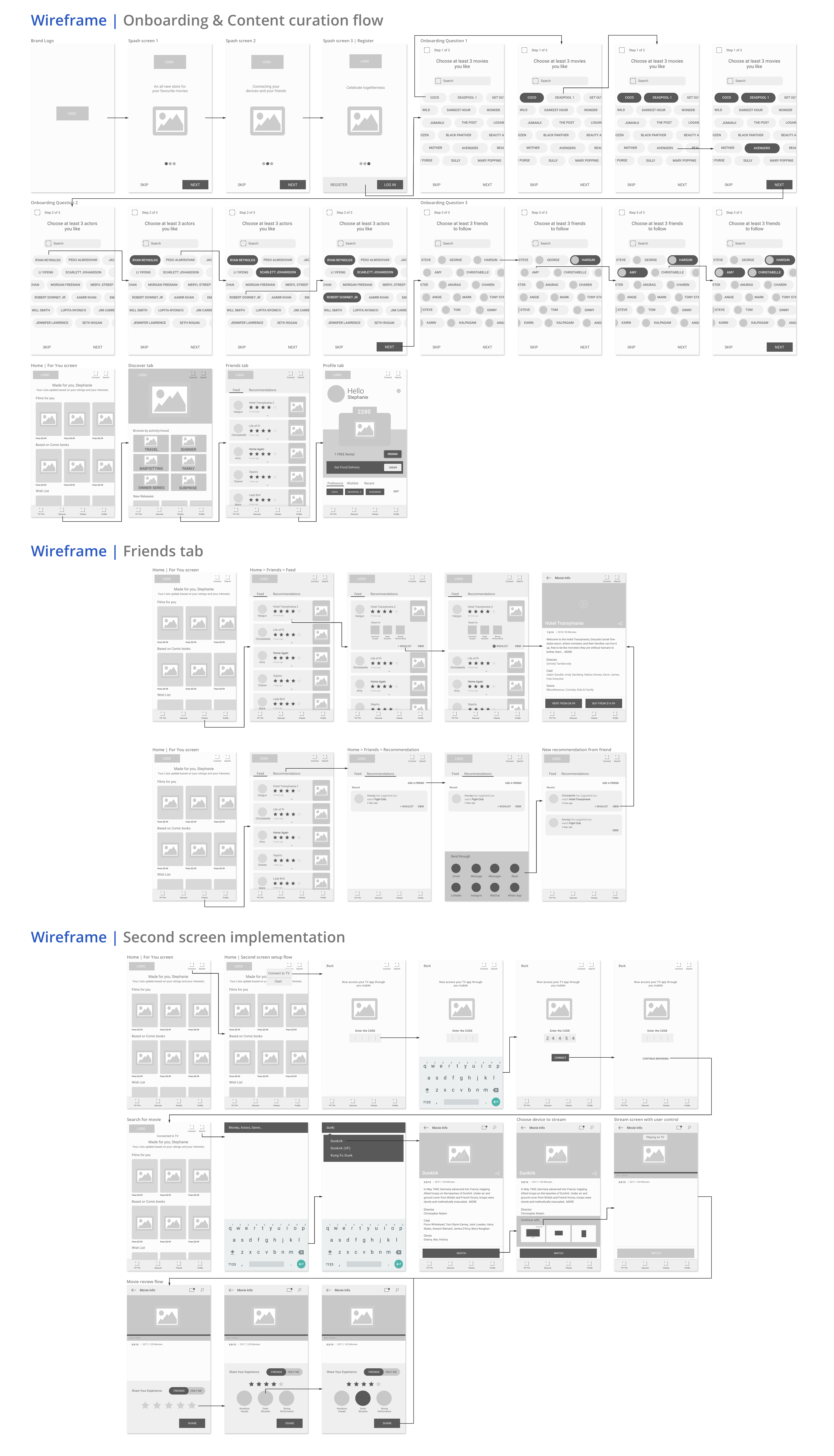
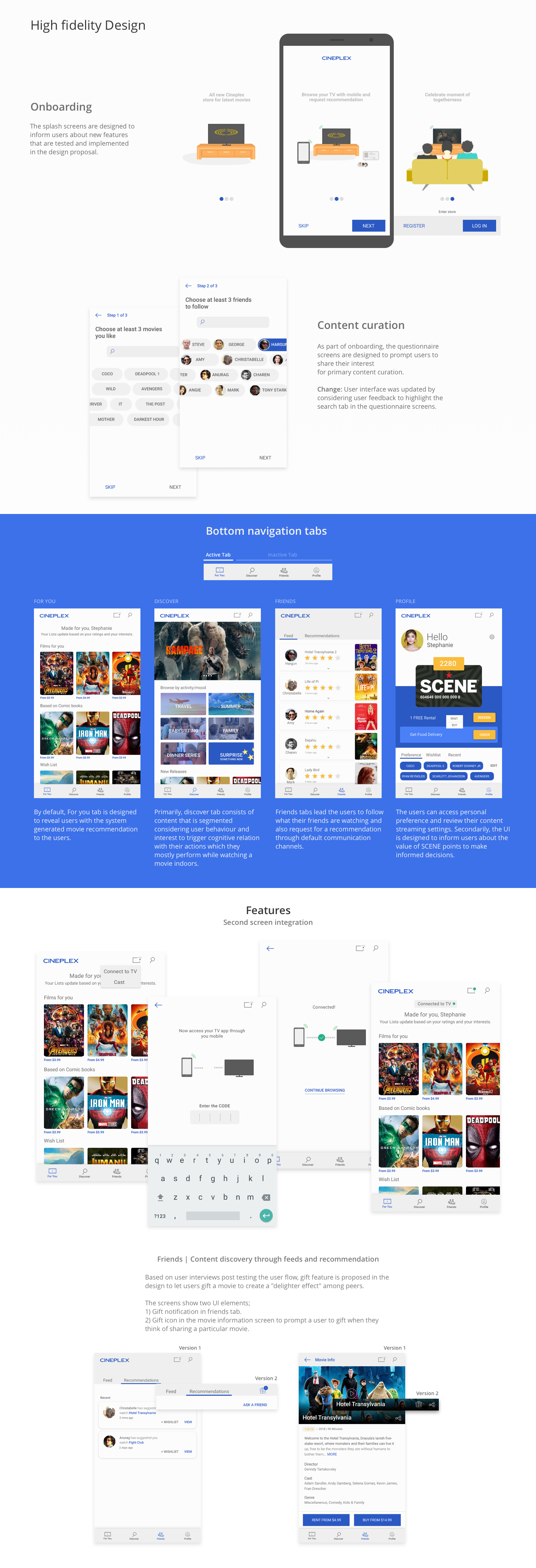
Once the wireframes are ready, I started understanding the brand guidelines and began working on user interface design. As cineplex store is an existing product, I initially concentrated in designing assets and style guide in sketch software to ease the process of iteration at the later stage.
The user interface was further designed in Sketch and prototyped in Invision to illustrate and test user interaction with three new user flows.
Secondary user test was conducted using the high fidility prototype and participants were chosen through LinkedIn and social media across three provinces in Canada. Open-ended questions and an online questionnaire was helped to understand and evaluate the approximation of user needs from the research.
The three new features were well received and users were delighted the most by the design solution that would let users view and request a recommendation from friends. Several key features like, informing the value of SCENE points and letting user to play through their mobile device was appreciated with constructive feedback for further improvement.
Are you ideating on something for your users? I would love to help make it happen! Drop me a message and we could meet over a coffee to talk about your project.